CSNW photos - part 2
Here I am again.
The theme of last night's project was that card that I couldn't think of a name for. The one with the folded centre with an aperture in it?
Here are the photos of their cards & I have taken the front of the card & then the card open to show the inside.
The theme of last night's project was that card that I couldn't think of a name for. The one with the folded centre with an aperture in it?
Here are the photos of their cards & I have taken the front of the card & then the card open to show the inside.
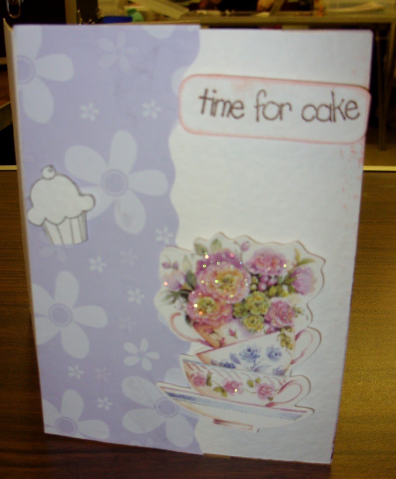
I love these teacups all nestling inside each other. The little cupcake still has to be coloured.
More cakes inside - don't they make you feel hungry looking at them?
A pretty thank you card & those butterflies really suit the floral paper.
The inside - that circular framed greeting is very nice too.
A very delicate design & I like the bow behind the square - a nice monochrome card.
This card isn't finished & therefore the folded section has not been glued together yet.
That delicate colouring also taken through to the inside.
I love that flower & the delicate shading with inks is really effective. The border has been stamped & then cut out to give that ribbon strip
There's the border strip again on the inside.
Very pretty card - I love the twine bows & again the shading probably this time with chalk.
The shading has been taken through to the inside as well.
Another delicate monochrome card. The light was behind this card - so you can see the layer on the inside.
It didn't show up the same "in the flesh"
The inside & this time there is an image strung on a piece of card & placed in the aperture. Card was used to hang the image in the aperture, as the ladey making the card didn't have any thread with her which would have been more suitable. I nice use of the aperture section of this style of card.
Another monochrome design & that is a really lovely stamp.
The border repeated inside along with a delicate inner topper. Very CAS card
Also a delicate design - I had taken the photo of this card upside down. It wasn't until I was working with it that I noticed the bird cage was upside down & when I looked at the photo of the inside ......
I realised my mistake. The inside is still upside down in this photo. I did try flipping the right way up but then it looked like it was falling off the table or hanging from the ceiling, & also didn't look right. So apologies for that - but I hope everyone can see the idea behind it.
I just love these lady stamps - so elegant & sophisticated. The border is very effective with the blending of the ink over it.
The border again taken into the inside - also another monochrome design.
I think this style of card is worth the little bit of fiddlyness to put it together because it is that bit different to standard card shapes & has that surprise inside.
Tomorrow I will be doing some more work on the sugar roses so may have some photos of that for you. Have a lovely evening. 'Bye for now.


Comments
Post a Comment
Please leave a comment - it is always nice to receive your thoughts.
PLEASE NOTE;
ALL comments are moderated & will not appear here until I have approved them - this is to avoid spam & junk comments. Apologies for having to build this in to the system