Mold photos - part 2
Good afternoon ladies
Before I show you the Mold photos I would like to share with you an email I had from Joanna of Mold club following me writing the post about their Show & Tell handbags....................
Before I show you the Mold photos I would like to share with you an email I had from Joanna of Mold club following me writing the post about their Show & Tell handbags....................
"Hi Gloria
Hope you don't mind me proof-reading your blog post!! ;)
It's something I can't help doing as it's been a big part of my job here
in our website design business.
I'm just looking at the bags post and noticed this:
"Joan: Reminded e of a nag I had back in the 60's"
(made *m*e smile thinking of you and a nag!)"
............... here is my reply ...............
"Hi Joanna
Firstly I have no problem at all with you proof reading
Secondly I probably did have a nag back then - I like the bracketed comment above) made me smile.
I am having quite a bit of trouble at the moment with my laptop keyboard.
I am not 100% sure whether it is the keyboard or my fingering when typing.
The letter 'm' is one of the worst keys.
I couldn't have re-read that bit
Gloria"
I decided to show this here - because I really don't have a problem if anybody spots mistakes. But I really do have a problem at the moment & the letter M - really is the worst of the letters that don't do what I want. You wouldn't believe sometimes how long it takes me to write a post - between key problems & normal mistakes. I spell check & I reread - but - errors still get through at times.
Now! down to the photos - the project was the twist & pop up card;
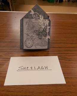
Sheelagh was so absorbed in making her card that she decorated as you see above - but it was supposed to sit inside a base card. So she said she would still put it inside a base card to make hers a little unique. It's a great design Sheelagh.
Clare has produced a really clean & simple design for her card & still has to put the detail on the inside.
Actually there were several ladies who didn't complete their card - so I hope to either receive emails with the photos or them being brought along to the next meeting.
Don't you just love these little owls on Yvonne's card? So bright & cheerful.
Rhiannon's card features those lovely "Gorjuss" images. Absolutely love the colour of the front focal image.
I did take a photo of the front of Joan's card - but it wasn't a clear image. The front was just decorated with the same paper as inside, & again there is the decoration still to go on this one.
Lovely clean design from Maureen with beautiful butterflies. They are a favourite of Maureens & quite often feature in her cards.
This really is a nice cad to make & not so complicated as it first looks, plus I have simplified the instructions somewhat. I look forward to seeing the others later.
Have a lovely weekend everyone - I think we are promised some sunshine for tomorrow which will be nice.
'Bye for now - have fun.


Comments
Post a Comment
Please leave a comment - it is always nice to receive your thoughts.
PLEASE NOTE;
ALL comments are moderated & will not appear here until I have approved them - this is to avoid spam & junk comments. Apologies for having to build this in to the system