Mold II meeting photos - part 2
Hello again - here I am with the photos of the project from last night's Mold II meeting. As at the other clubs it was using the technique of one layer stamping. I like this technique, as I think I have said before, I do like the clean & simple finishes & this one works really well. Once again, at the start I demonstrated 2 ways to use the technique - creating the look of layered torn paper on the folded edge & a torn aperture shape for a focal image. As always the ladies tried these & also put their own slant on things & some of them were quite prolific too. Take a look -


That is me for now. I have a"me" day today. This afternoon I am at the hairdressers. But before that I am at the Chiropodist. So! being topped & tailed so to speak.
I may be back as I have a card to put on the projects page.
'Bye for now have a good day.

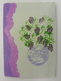
Doesn't that "torn paper look" show off the vase of flowers well? Very nice.

This card shows that it doesn't have to be white card - colour works well too - giving this card a vintage look.

The central colour was produced by using postage notes to create the shape. The straight lines to the background gives an even fresher look & the image coming off that colour works so well.....

...& another card in a similar style, made by the same person I am sure.

The edge looks just as good along the top of a landscape card as well as down the side on a portrait card.

This doesn't need anything else does it? Although I appreciate that if you do like quite a bit on your cards this style can be hard to work with.

Again the design says everything & such a lovely sentiment

Another lovely sentiment & a different centre one layer. Dot, who made this card, had cut herself a mask from thin acetate, using her die-cutting machine & a die, & the different ink on the edges works so well. Now why hadn't I thought of that. Where is my box of acetate?

An unusual use of the sentiment twice on the design - but I think it works really well - due to one being on the dark ink & the other on the lighter shade. Very nice.

It wasn't until I loaded this photo that I realised I hadn't asked how the centre shape had been made. It looks like another die-cut mask. This time the card has been fully inked but in different shades of the same colour including the stamped image. Monochrome always looks good - a really nice card. Perhaps the lady who made this card will get in touch with details!

Currently my favourite colours of Distress Inks & that stamped image is beautiful. Very nice indeed.

Now, I have this colour pink & I don't seem to get on too well with it - on this card it works beautifully.

One of the experiments - a double coloured background for an image.

This one is quite amazing. The top edge looks like a really stormy sky & I love the quick thought to make a little paper boat to pop on the stormy sea. Again it also shows the card does not have to be white.

A very dramatic effect on this one too. This technique can give so many different finishes.

I wonder if this one will be getting a nice sentiment to go between the two sections.

This is exactly the idea of this technique, as we have already seen in the samples above. I just love this style of stamping, & what a savings on postage - especially with Christmas coming up.

Oh he is just ducky. (Sorry couldn't resist that one) What a lovely card for a child.

This card is just lovely & I think the narrow shading down the right-hand side just finishes it off. Much better than leaving it white. Don't you think so too?

Isn't he something? Love his collar & bow tie, again the image works on & off the colour block.

This card & the card above were made by Rita who had a field day last night. Within a short space of time she had made about 4 cards.

These silhouette flower images work so well with this technique. Simple & beautiful.

Another monochrome card - always works well & one of my favourite colours too.

Ah - he is cute. I may have made this point before - but he looks like the little dog that is the trade mark for some rather expensive handbags. My daughter in law would love it.

This is one of Rita's cards & everyone was curious as to how she managed to get the different shade on the stems of the flowers to that of the colour on the flowers themselves. Turned out the ink pad had the colour on it. Not sure if it had got mucky from another stamping or was wetter at that edge. But it showed that if you want to take the time that could have been done deliberately by using 2 ink pads.
I have one more photo to show you - it wasn't part of the evenings project but Dot had brought it along with her & it was so lovely I just had to include it.

It is all one layer stamping & there is that lovely image that was used on the Twinchie card as well.
So, if you have any cards that you are making, or have made, that link in some way to what we are doing please bring them along so that I can include them here on the blog. I might not use them straight away - but reasonably close to you showing them - it helps give me some photos to show on days when I really don't have much. The blog is far more interesting when there are photos.
I may be back as I have a card to put on the projects page.
'Bye for now have a good day.


Hi Gloria, the double oval card in shades of green was mine. I put down an oval perspex shape, it was from a set I'd won at the club years ago (for tearing paper shapes I think.),I inked around it, then put down 1 of Dot's scalloped oval templates and inked within the shape, then I stamped inside it and lightly brushed all over the card. et voilà! Regards Carolyn
ReplyDelete